To schedule a free live demo on your cell phone pick an appointment date
LOCKDOWN Rescue Plan
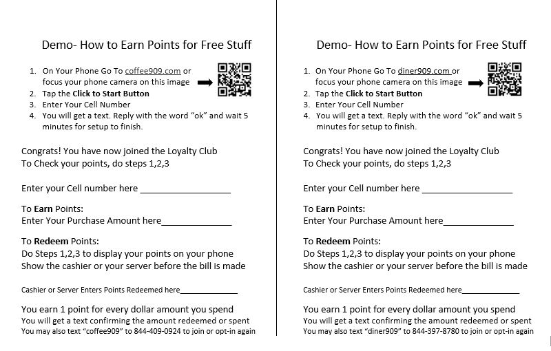
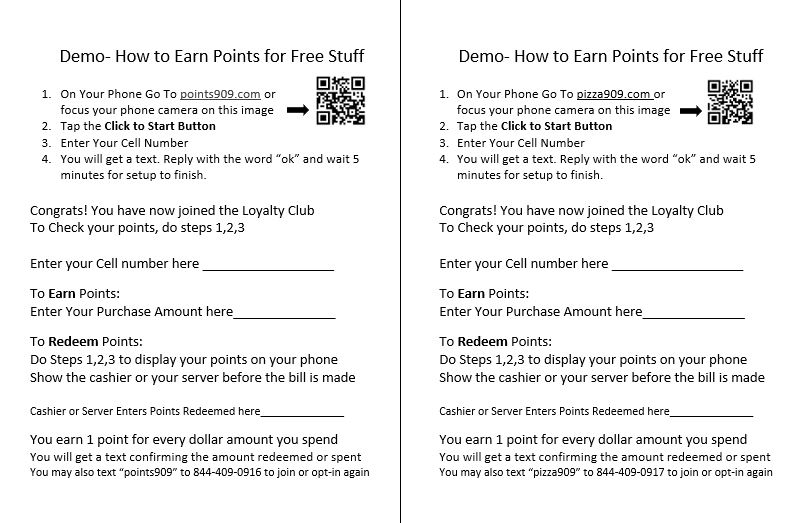
If you have a Repeat Customer type of business we will set up a form for you similar to the ones below and give you a trial account free for 60 days. It will capture your customer’s cell number, reward them for being loyal, and allow you to use a text blast to promote your product or service. No Obligation. See for yourself if this works for you.
Fill in the appointment form above for a 10 minute “On Phone” demo.